K I N E T I C
F O N T S

Bachelor Thesis by Simon Truffer

Kinetic Fonts – Type Moving Forward

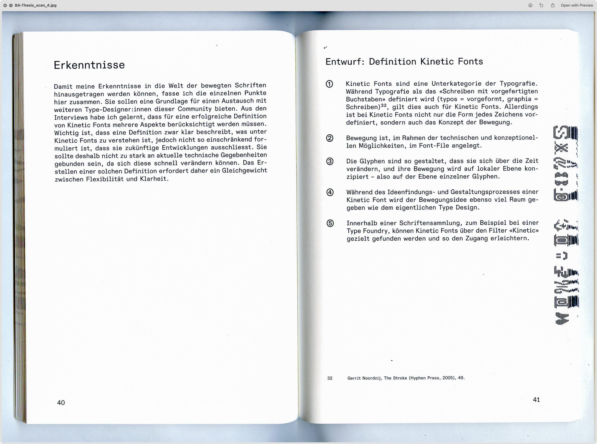
The starting point of Kinetic Fonts – Type Moving Forward is the exploration of typefaces designed to be experienced in motion, with movement embedded directly within the font file itself. Through research and interviews with type designers working in this field, the concept of Kinetic Fonts emerged as a new typographic category that evolved over the course of the thesis. It defines typefaces in which motion is not applied afterwards but conceptually integrated into the design process. While such typefaces are often described as experimental variable fonts, this project aims to establish a clear definition and theoretical foundation, providing a framework for their recognition within the world of typography.

The thesis consists of two parts: a theoretical study developing the conceptual foundation for the manifesto, and a practical part translating these ideas into four original Kinetic Fonts. The project was developed at the Bern Academy of the Arts during the spring semester of 2025 as part of the Bachelor’s programme in Visual Communication. It was mentored by Miriam Koban for the theoretical part and Edgar Walthert for the practical part.

The final work was presented as a physical installation at the FINALE25 exhibition, where the fonts were displayed in an interactive setting. Visitors could use a QR code to change the words displayed on the screen and explore the variable font parameters through physical sliders and knobs.

Exhibition at FINALE25

Project reference still one

Theoretical Part

The theoretical part of the thesis investigates the conceptual and practical conditions of Kinetic Fonts. Unlike conventional animated typography, where a type designer first creates static letterforms and a motion designer subsequently animates them independently, Kinetic Fonts are developed by a single hand. This approach redefines the relationship between design and animation by making motion an inherent component of the typographic system itself. To examine this field, interviews were conducted with type designers who actively work in this area: Bas Jacobs (Underware), Edgar Walthert (Font Spectrum), and Travis Kochel (Future Fonts). Each provided distinct perspectives on how technology, authorship, and workflow evolve when movement becomes a structural part of the design process.

The conceptual foundation was informed by Barbara Brownie’s taxonomy of temporal typography and the OpenType 1.8 specification, which introduced the variable font format. Brownie distinguishes between global motion, where movement occurs on the level of the whole word or sentence, and local kineticism, where movement takes place at the level of the individual glyph. The research, combined with the interviews, led to the formulation of a propositional draft for a manifesto outlining the core principles that define Kinetic Fonts.

Printed Thesis

Project reference still one Project reference still two Project reference still three Project reference still four Project reference still five

Manifesto

Following the completion of the theoretical thesis, the initial draft of the Kinetic Fonts definition was expanded into a collaborative framework, with the goal of enabling designers and researchers from the field to review, comment, and contribute to the manifesto. The manifesto outlines the conceptual, technical, and practical principles of Kinetic Fonts, defining them as a subcategory of typography in which movement is embedded within the font file itself. Each glyph is designed with a choreography, and motion becomes an integral design parameter rather than an external effect. Through this ongoing exchange, the manifesto has grown beyond its initial proposal. The outcome of this feedback loop will be published at kineticfonts.info (coming soon).

proposal Manifesto

Practical Part

Based on the manifesto, the practical part of the bachelor’s thesis explores its translation into concrete font concepts. The goal was to investigate how different approaches could demonstrate the range of possibilities within the framework of Kinetic Fonts. I began by sketching various ideas, and in a second phase, I developed four selected concepts that illustrate different conceptual and technical approaches.

The font specimens were created in DrawBot to showcase each font. Together they form a practical exploration of the manifesto’s propositions.

Design Explorations

Project reference still one Project reference still two Project reference still three Project reference still four Project reference still five

KF Dazzel

RAZZEL DAZZEL takes its inspiration from dazzle camouflage, a pattern historically used to obscure the contours of ships. The constant displacement produces a flickering texture that blurs the boundary between legibility and abstraction. The movement is executed on a single variable font axis, where the first and last state are identical, resulting in a continuous looping motion.

Font Specimen

Motion showcase

A B C D E F G H I J K L M N O P Q R S T U V W X Y Z
Type Tester

KF SURROUND

The SURROUND concept font uses three variable font axes – Animation, Wave Amplitude and Wave Direction – to control the motion of each glyph through harmonic oscillation. To cover all possible steps of the movement, 208 masters were generated, defining the full range of dynamic transformation.

I first drew the font as a static pixel font and then used a Python script to calculate the pixel displacement for each possible step. Once rendered and exported as a variable font, the result runs seamlessly – translating complex wave motion into smooth, continuous typographic movement.

Font Specimen

Motion Showcase

A B C D E F G H I J K L M N O P Q R S T U V W X Y Z
Type Tester

KF NOORD

NOORD is inspired by the movement of a broad-nib pen. Each letter is constructed from several lines. It uses three variable font axes: one for the nib angle, which also drives the animation, one for the width, and one for the thickness. Together they simulate the behaviour of a broad-nib pen in motion.

Font Video Specimen

Font Explorer

A B C D E F G H I J K L M N O P Q R S T U V W X Y Z
Type Tester

KF Jive

JIVE comes in two variations. In the first, every movement can be controlled manually through three variable font axes, allowing precise direction of each glyph’s motion. It is showcased with the letter A, where every node can be moved individually. In the second variation, each letter performs a predefined choreography along a single axis. In this version, each glyph comes with two distinct dance moves.

Font Explorer

A A B B C C D D E E F F G G H H I I J J K K L L M M N N O O P P Q Q R R S S T T U U V V W W X X Y Y Z Z
Type Tester

Thank you for exploring my Bachelor Thesis :)

If you have any questions or feedback, feel free to reach out to me at simon.truffer@protonmail.com